
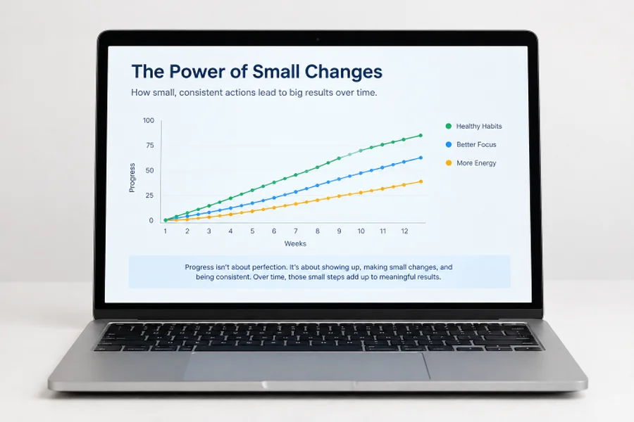
How to Make Accessible PowerPoint Presentations
Key Takeaways
- Accessible presentations help more people follow, understand, and use the information.
- Clear structure matters as much as visual design.
- Titles, reading order, contrast, alt text, captions, and readable data displays should be reviewed early.
- Automated checks are useful, but they do not replace a human review.
- Test the version your audience will actually receive or view.
Accessible PowerPoint presentations help more people understand, navigate, and act on your message. Whether you are presenting in a conference room, sharing a deck by email, or recording a training session, accessibility should be part of the workflow from the first draft. Tools such as an AI PowerPoint generator can speed up slide creation, but the final deck still needs deliberate decisions about structure, language, visuals, and delivery.
A polished deck is not automatically an accessible one. Small issues, such as unclear slide titles, weak contrast, unlabeled charts, or videos without captions, can make essential information harder to use. Building accessibility into each stage creates clearer presentations for all viewers, including people using assistive technology or reviewing the slides without your narration.
Table Of Contents
- Why Presentation Accessibility Matters
- Plan an Accessible Deck Before Designing
- Use Clear Slide Structure
- Improve Text and Visual Readability
- Write Useful Alt Text
- Design Charts and Tables for Clarity
- Add Captions and Reduce Motion
- Run Accessibility Checks
- Test the Final Delivery Format
- Use a Final Accessibility Checklist
1. Why Presentation Accessibility Matters
Inaccessible slides can prevent people from reading text, interpreting a visual, hearing important content, or moving through the deck logically. Accessibility also supports people working from a small screen, sitting far from the display, viewing in bright light, or catching up after a meeting. The principles behind the W3C recommendations for improving web accessibility, including making information perceivable and understandable, are useful reminders for presentation design.
Your audience may include people who use screen readers, have low vision or color vision differences, are deaf or hard of hearing, or process information differently. It may also include people who simply need to open the slides later without the context of your spoken explanation.
2. Plan an Accessible Deck Before Designing
Start by defining the audience, objective, setting, and final format. A deck used in a live presentation may need speaker notes and verbal descriptions, while a file posted online must stand on its own. Decide early whether you will share a PowerPoint file, a PDF, a video recording, or all three, because each format requires its own review.
Create a brief content plan before choosing colors, images, or animations. Give every slide one clear job, such as explaining a problem, showing a decision, or summarizing a result. If the audience needs captions, larger text, transcripts, translated materials, or downloadable notes, include those requirements in the plan rather than treating them as a last-minute fix.
3. Use Clear Slide Structure
Use built-in slide layouts and placeholders whenever possible. They provide a more reliable starting point than manually placing every object. Give each slide a unique, meaningful title that communicates its point. “Customer retention rose in Q2” is more useful than “Results.”
Keep the reading order logical: title first, then the main takeaway, followed by supporting text, data, visual details, and source notes. Avoid putting critical information only inside a decorative shape, image, or screenshot. If someone cannot access that object, the message should still be available in text or spoken narration.
4. Improve Text and Visual Readability
Use short sentences, familiar language, and a consistent typeface. Keep body text large enough for the room or screen where the deck will be viewed, and leave space around headings, paragraphs, and visuals. Dense slides force viewers to choose between reading and listening.
Use strong contrast between text and backgrounds. Avoid small text on busy photos, low-contrast color combinations, and layouts that rely on color alone to communicate status or priority. Pair colors with labels, icons, patterns, or direct wording, such as “On track” and “Needs attention.”
5. Write Useful Alt Text
Alt text should explain why an image, diagram, icon, or chart matters on that slide. For a simple photo, one concise sentence is usually enough. For example, describe the relevant action or outcome, not every background detail.
Complex charts may require a short alt text description plus a fuller explanation in nearby slide text or speaker notes. Mark purely decorative objects as decorative when available. Review automatically generated descriptions carefully because they may identify objects without capturing the intended meaning.
6. Design Charts and Tables for Clarity
Choose the chart type that answers the audience’s question, then state the takeaway in the title or a brief callout. Label lines and bars directly when practical, show units and dates clearly, and identify the data source. A chart should not require viewers to decode a distant legend to understand the point.
Keep tables compact and use actual table structures rather than screenshots of spreadsheets. Avoid merged cells and unnecessary visual lines. When data is too detailed for a slide, provide a readable summary of the trend, comparison, or decision that the data supports.
7. Add Captions and Reduce Motion
Add accurate captions to videos and recorded audio when spoken content is important. Provide a transcript when it will help viewers review the material, search for key points, or access information in a quiet setting. Automatic captions are a useful starting point, but names, technical terms, and speaker changes need review.
Use animation only when it improves understanding. Avoid flashing effects, rapid movement, or transitions that make text difficult to follow. During a live presentation, describe important visual changes aloud and allow enough time for the audience to read each slide.
8. Run Accessibility Checks
Use PowerPoint’s built-in checks throughout the editing process. Microsoft recommends reviewing items such as missing slide titles, alt text, reading order, contrast, table structure, and captions through its PowerPoint accessibility guidance.
Do not assume a clean automated report means the deck is fully accessible. Check whether the alt text is meaningful, the slide makes sense without narration, and the order matches the message. If the same issue recurs, fix the slide master or template rather than repairing each slide individually.
9. Test the Final Delivery Format
Test the exact file and platform your audience will use. Review the PowerPoint file separately from the exported PDF, as reading order, links, media, and descriptions may behave differently. Confirm that videos, audio, captions, and animations work on the device used for delivery.
Navigate several slides with a keyboard and, when possible, use a screen reader to check titles, object order, and descriptions. For virtual events, test live captions, screen sharing, chat access, and any downloadable materials before the session begins.
10. Use a Final Accessibility Checklist
- Does every slide have a unique, meaningful title?
- Is the main point easy to identify quickly?
- Is the reading order logical?
- Are informative visuals described clearly?
- Is text readable at the expected viewing distance?
- Is color supported by labels, symbols, or plain-language wording?
- Are charts and tables understandable without guesswork?
- Do videos include reviewed captions?
- Have links, media, and exported files been tested?
- Can the deck be understood without the presenter’s narration?
Conclusion
Accessible PowerPoint presentations are built through consistent, practical choices. Clear titles, logical structure, readable design, useful descriptions, and tested media make information easier to use in more situations. Treat accessibility as part of planning, design, editing, and delivery, and your presentation will be stronger for every member of the audience.