What Does Icon Từ Chối Mean? The Small Red Symbol You Tap Without Thinking
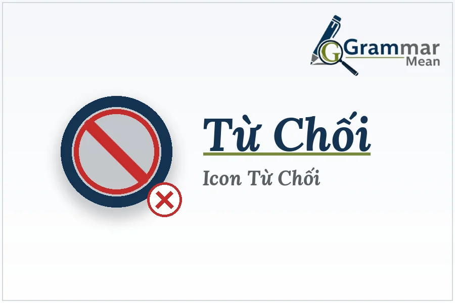
You’ve hit it before. Probably today. A little red X on an incoming call, a grey button under a follow request, that “no thanks” you click on a cookie pop-up without reading a word of it. That’s an icon từ chối — Vietnamese for “reject icon” or “decline icon.” No text needed. Your brain just knows.
It’s a small piece of design, but it does a lot of quiet work. Every time you say no to something on your phone, there’s probably a reject icon behind it. Let’s actually look at what this thing is, where it hides, and why good designers obsess over something most people never notice.
What Is an Icon Từ Chối, Exactly?
Strip away the jargon and it’s simple: a reject icon is any small graphic that means “no” or “decline.” A red X. A phone with a line through it. Sometimes a hand is held up like a stop sign.
Why not just use words? Speed, mostly. Nobody wants to read “decline this call” while their phone is buzzing in their pocket. A shape does it faster than a sentence ever could. That’s really the whole job of an icon từ chối — get you to “no” before you’ve had time to think about it.
Where This Icon Shows Up More Than You’d Guess
Once you start noticing it, you can’t stop:
- Phone calls, obviously — accept on one side, reject on the other
- Friend requests on Facebook or similar apps
- Cookie banners, the ones asking to track you
- Permission prompts for your camera, mic, or location
- Message requests from strangers
- Form errors that flash red when you mess up a field
Different shapes, same job. Stop. Not this. Not now.
How Big Platforms Actually Use It
Here’s where it gets interesting. Every major app has its own take on the reject icon, but the logic barely changes across any of them.
| Platform / Feature | What It Means | What It Looks Like |
| Facebook Friend Request | Turns down a friend request quietly, no notification sent | Small “Delete Request” X near the name |
| Instagram Follow Request | Rejects someone trying to follow a private account | Grey “Delete” button below the request |
| Zalo / Messenger | Refuses or ends an incoming call | Red phone icon, angled downward |
| WhatsApp Call Screen | Declines a voice or video call | Round red button, phone icon flipped |
| Cookie Consent Pop-ups | Refuses tracking or data collection | Grey outlined “Reject All” button |
| App Permissions | Denies access to camera, mic, location, etc. | “Don’t Allow” next to a small X icon |
Notice how almost none of these are green or blue. Red and grey dominate for a reason — your eyes catch “stop” colors before you’ve even read the label.
What Actually Makes a Reject Icon Work Well
If you’re the one designing this stuff, a few things matter more than people assume.
Color needs to stay predictable. Red means stop in most of the world, and fighting that instinct just confuses people.
Size matters too, more than you’d think. A tiny reject button squeezed next to a huge accept button feels off, even if users can’t say why.
A label helps, when there’s room for one. Icons alone can trip up first-time users, so pairing the icon từ chối with a short word like “Decline” removes the guesswork.
Stick to one metaphor. If a trash can means delete somewhere else in your app, don’t reuse it for reject. Mixed signals cost you trust.
And test on a phone, not a desktop mockup. Most people are rejecting things mid-scroll with one thumb, half paying attention. If it’s not obvious fast, it’s not working.
Mistakes That Trip Up Even Good Apps
A few things keep showing up in bad designs:
- Accept and reject buttons that look almost identical
- Reject icons buried smaller than the accept option
- No confirmation step before something serious gets rejected or deleted
- Icons so vague they could mean “close” instead of “decline”
None of these sound like a big deal on their own. But they’re exactly the kind of small friction that makes someone reject the wrong thing by accident, then blame themselves for it.
Short Answers
| Question | Short Answer |
| What does icon từ chối mean in English? | It translates to “reject icon” or “decline icon” — a symbol used to refuse an action. |
| Where do you usually see a reject icon? | Call screens, friend requests, cookie banners, and permission pop-ups. |
| What color are most rejected icons? | Red, most often, since it’s the universal color for stop or no. |
| Is a reject icon the same as a close icon? | Not quite. Close just shuts something; reject actively declines it. |
| Why do apps use icons instead of words for rejection? | Icons register faster than text, so users can react in under a second. |
Final Words
Honestly, nobody thinks about the icon từ chối until it’s confusing or missing entirely. Get the color right, get the size right, and people will say no exactly when they mean to — without a second guess, and without blaming your app for it.
FAQs:
What shape is a typical icon từ chối?
Usually a red X, sometimes a crossed-out phone or a stop-hand symbol.
Does the reject icon always have to be red?
No. Grey or outlined versions work fine for lower-stakes actions like cookie prompts.
Should reject icons include text labels?
Not always necessary, but it helps new users avoid tapping the wrong thing.
Is icon từ chối a Vietnamese phrase?
Yes. It translates directly to “reject icon” or “decline icon” in English.